
Last May I published a blog post describing the main features of the Planner Gantt Chart I had been working on. Now I finally took some time and released a new version of the app. You can still download the app from the same place, use it freely in your organization and make any modifications to it as you please.
👉 https://github.com/TerhoAntila/planner-gantt-chart
Theming
Truth is, I sort of got tired of the green color scheme of the app. Therefore I decided to change it and refactored the app so that updating the theme is a walk in the park for anyone ever authored a Power Apps canvas app before.
Hence the app now looks like below.
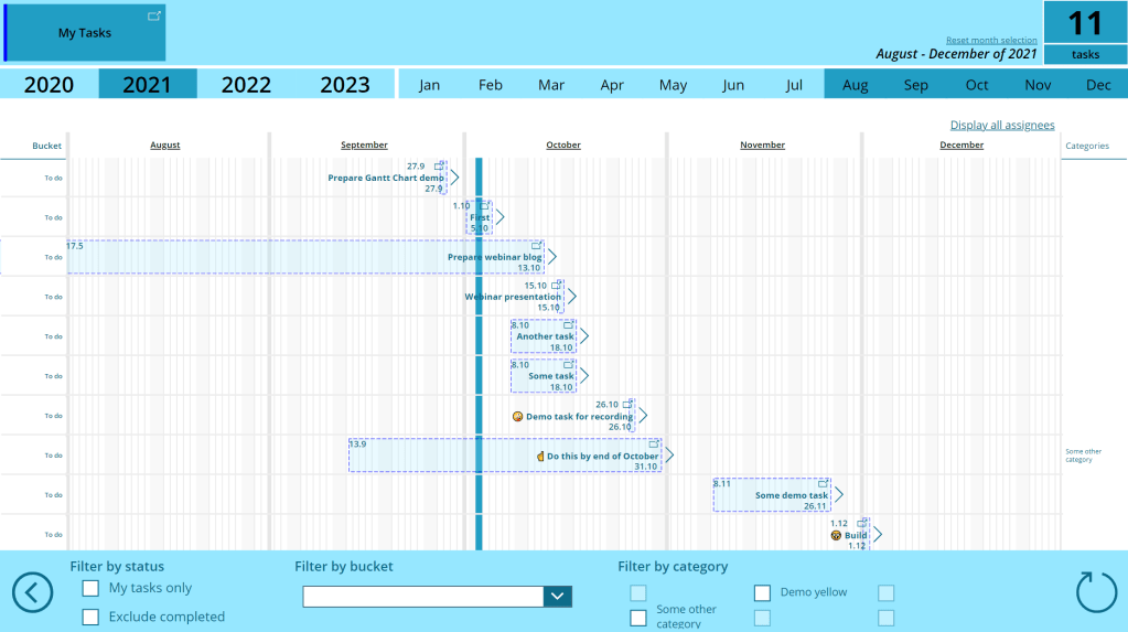
As you can see, it is blue!
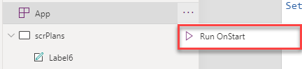
Did you like the old color better? Worry not, you can easily change it back to green by simply modifying the line 21 of the app’s OnStart Power Fx code.
Set(PredefinedThemeBlue,
    {
        Color: {
            Dark: RGBA(12, 108, 138, 1),
            LighterDark: RGBA(33, 158, 196, 1),
            Light: RGBA(150, 231, 255, 1),
            TaskBackground: RGBA(150, 231, 255, .2)
        }
    }
);
Set(PredefinedThemeGreen,
    {
        Color: {
            Dark: RGBA(99, 139, 44, 1),
            LighterDark: RGBA(127, 178, 57, 1),
            Light: RGBA(232, 244, 217, 1),
            TaskBackground: RGBA(232, 244, 217, .2)
        }
    }
);
Set(Theme, PredefinedThemeBlue);
ClearCollect(colPlanColors, [
    {
        index: 1,
        indicatorColor: RGBA(0, 0, 255, 1),
        chartColor: RGBA(0, 0, 255, .6)
    },
    {
        index: 2,
        indicatorColor: RGBA(255, 0, 0, 1),
        chartColor: RGBA(255, 0, 0, .6)
    },
    {
        index: 3,
        indicatorColor: RGBA(255, 215, 0, 1),
        chartColor: RGBA(255, 215, 0, .6)
    },
    {
        index: 4,
        indicatorColor: RGBA(75, 0, 130, 1),
        chartColor: RGBA(75, 0, 130, .6)
    }
]);
Set(varMaxSimultaneousSelectedPlans, CountRows(colPlanColors));
Set(varCurrentUser, Office365Users.MyProfile());
As you can see, the code block has changed a bit. I have created two predefined simple themes called PredefinedThemeBlue and PredefinedThemeGreen. If you want to switch back to the green color schema, simply change line 21 into:
Set(Theme, PredefinedThemeGreen);Once you run the OnStart code again, the color of the app is immediately changed!

You can easily add your own themes as well. Simply create a new predefined theme variable and provide RGBA values for each of the four colors. Below is a short explanation of how each of the colors is surfaced throughout the app.
- Dark – This is basically text color and also used in icons and buttons. Contrast of this color should be somewhat high compared to others
- LighterDark – This color is used to highligh stuff in the app, but should be lighter than the color defined as Dark. Examples where used: month range selector’s selected months, current date indicator (vertical bar), number of tasks visible (right hand upper corner)
- Light – This is basically a background color of various sections in the app when it’s not white
- TaskBackground – As the name suggests, this color is used to fill the task block on the canvas
One might ask that why do we have a separate color for task blocks? I wanted the task block to have some opacity so that the underlying grid lines can be seen through it. Unfortunately Power Fx ColorFade function does not support altering the alpha channel of the color – it merely changes the color toward black or white.
Other modifications
While implementing the theming feature, I also made some other minor modifications to the app.
App icon and tile color
App icon is changed from one of the out-of-the-box icon into on of my own. And to comply with new theming feature the tile color is changed from green to gray.
(If you’d prefer some other app icon, please feel free to do change it)
Task dates
There were some problems with task start and end dates, which are now taken care of.
If task starts before the first selected month or rolls over the end of the canvas, dates are now still shown.
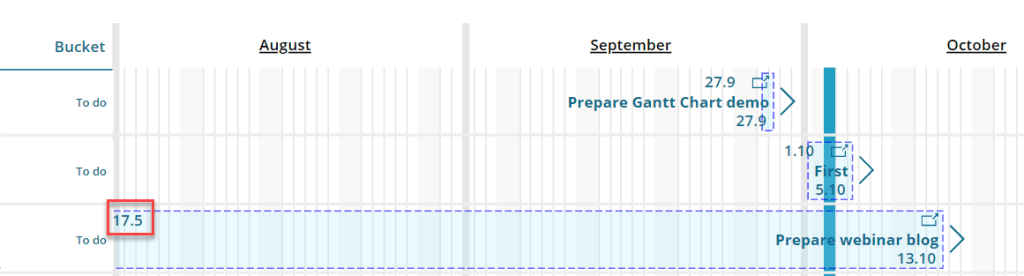

There was also a bug in displaying longer dates (with two numbers and the dot) which caused the date text to wrap and made it basically unreadable – that’s also now fixed.
Tasks rendered within flexible height gallery
This modification was done as a preparation for some other upcoming new features and the change is not visible to the end user for now.
