Let’s face it: sometimes canvas apps end up too complex and users get easily little bit lost with where to find which functionality or even what features are available. To be easily able to provide some help to end users I implemented a new Power Apps component which you can download from my brand new Power Apps Components repository. The component is published under MIT license so you can basically use it any way you like.
The repository is divided into folders – each folder containing a single Power Apps canvas component that you can easily include in your app. Generic instructions on how to import the component as part of your app can be found at the top level README file.
Currently the repository contains only one component: Screen Guides. In this blog post I’ll walk you through what you can do with it and how to use it.
Overview
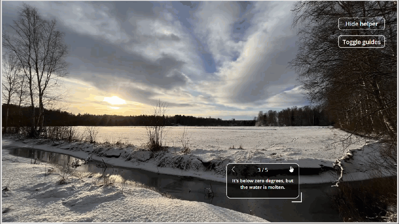
Screen Guides provides an easy way for you to add instructive text blocks over you app. Check out the short video below.
The app I am using Screen Guides on is really simple – containing only one image (the scenery), the Screen Guides component and two buttons:
- Show helper: Clicking on this either shows or hides the component and resets it if shown
- Toggle guides: Only displayed if the component is visible. The button toggles component’s DisplayGuides boolean property
Next I’ll walk you through how I’m using the component in this simple demonstration app.
Using the component in your app
Importing the component
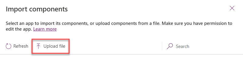
Once you have downloaded the component on your computer, you can import it into your Power Apps canvas app easily:
In Power Apps studio, go to Tree view > Components and behind the three dots context menu next to New component choose Import components.

Next click on Upload file and choose the downloaded msapp file from you computers.
You are now all set and the component is available in you app.

You can now go back to Screens tab and start using it your app!
How I’m using it in my demo app?
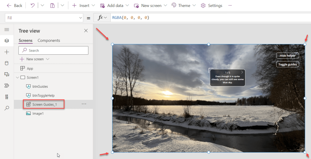
Step #1: Add the component and make it full size
It is only possible to place the information text blocks over the area that is covered by the component. Therefore you typically need to make the component full size on you screen as I have done below.
Step #2: Initialize the collection of information text blocks
The component knows which text to show, where to show the and in which order by reading a Table input property that you must provide a value in component’s Targets property. I’m initializing the collection in my App OnStart property, but typically you might want to do it in you Screen’s OnVisible or you can build it dynamically based on you user’s actions, for example.
Below is my demo app’s OnStart Power Fx code.
ClearCollect(helperData,
    { targetX: 668, targetY: 138, text: "Even though it is quite cloudy, you can still see some blue sky." },
    { targetX: 415, targetY: 334, text: "Even the sun is visible occasionally 😎" },
    { targetX: 752, targetY: 524, text: "It's below zero degrees, but the water is molten." },
    { targetX: 873, targetY: 138, text: "You can use this button to get help with my coordinates 😉" },
    { targetX: 863, targetY: 231, text: "No snow on the branches of the trees." }
);
Set(varDisplayGuides, false);
Set(varDisplayHelper, false);
I’m initializing helperData collection with five records – each record represents a position on the screen where I want a single text block guide to appear. Each record contains three essential properties:
- targetX: x coordinate of the text block
- targetY: y coordinate of the text block
- text: the text of the text block
Note, that also the order of the record matters: the blocks are displayed in the order they are provided.
With this, I am now ready to define properties of the component to configure it properly. The component expects the following properties to be provided:
- Color
This is the background color of a single text block. I am using value RGBA(0, 0, 0, .6) in my app to have a transparent black background. - DisplayGuides
Whether x- and y-coordinate sliders should be displayed on screen. This property is meant for app’s design time to help extract coordinate values of text blocks. See the next section for more information. In my app I am providing variable varDisplayGuides as the value for this property. - Targets
The collection of text block records with coordinates. I am using the variable helperData as the value for the property.
With the above properties set you are now ready to test drive your guides!
Get help with coordinates
If you take a look at the Power Fx code block introduced earlier in this blog post, you might wonder how the heck does this guy get those exact coordinates for different text blocks?!? There are various ways to get those, for example:
- Trial and error
Try a set of coordinates, test it, fix, test again… - Use actual object coordinates in your app
Let’s say you have a container called contSidePanel in you app. Now you could use the coordinates of that container to get started with the guides:
{ targetX: contSidePanel.X, targetY: contSidePanel.Y, text: “You can use this side panel to navigate between different screens in your app” }
Note, that the coordinates provided here apply to the upper left corner of the Screen Guide‘s text block container. Therefore the coordinates provided here are probably not precisely what you want… But you can start with that and then replace the values with exact coordinates retrieved by using Guides sliders! - Guides sliders
If you set component’s DisplayGuides property to true, you can easily fetch desired coordinates in play mode. You can use the x and y sliders to position text box in pixel perfect way and then copy the entire record declaration from the label value below the text box. See the below short video as an example.
Download, start using it and provide feedback!
So, do you want to take advantage of this component in your own app? Go ahead and download the msapp file from my GitHub repository and follow instructions in this blog post to get started!
What do you think about this? Do you have ideas to develop it further? Do you have some ideas of other components that would be needed in the community?
Don’t hesitate to leave comments in this blog post or report an issue in GitHub.
 terhoantila.com