
You are probably aware of the out-of-the-box rating control in Power Apps. It’s a good way of presenting a rating if all you need is whole number values. Let’s say you need a 5-star rating with possible values from zero to five. If it’s okay, that possible values are 0, 1, 2, 3, 4 and 5, the out-of-the-box rating control is your choice.
By the way, do note that the rating control rounds decimal numbers always down. If you have e.g. value 3.1 or 3.999, they are both shown as three stars in the rating control. If you want to display 3.9999 as four start, you need to use the Round function when passing the value to the control.
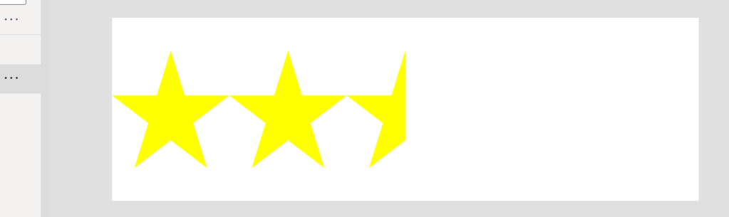
Round(3.999, 0)In the recent case I was working on, the customer wanted a five-star rating, but also wanted support for decimals. Basically, the customer wanted value 2.5 shown as in the image below.

That can’t be achieved with the out-of-the-box rating control. Instead, we need to create our own!
Create a new Component called Rating
Create a new Component and add the following custom input properties to it:
- Color of type Color
- Number of Stars of type Number
- Value of type Number
Adjust the width and height of the component to your preference. I am using 640 x 200. Temporarily, set the fill color of the component to something other than the color of the area where you are going to drop the control.
Initialize custom property values to something that makes sense, e.g.
NumberOfStars: 5
Color: Yellow
Value: 2.5
Add horizontal gallery for the stars
Add a new horizontal gallery that fills the entire component canvas. Change the following properties:
Items: Sequence(Rating.NumberOfStars)
TemplateSize: Self.Width / Rating.NumberOfStars
ShowScrollbar: false
TemplatePadding: 0
Rename the control as galStars.
Create a star template image
For this solution, we need a star template image – not a traditional star. I used PowerPoint to create a white rectangle that has a star shape subtracted from it.
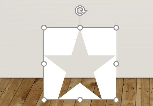
After that I can save the template as an image.
NOTE: You should use template fill color that matches the background of the area where you are going to use the rating control. Mine is white.
Add the template image to the gallery
Add an Image media element to you vertical gallery and choose the star template file you just created. Rename the image control as imgStarTemplate. You end up with something like below.

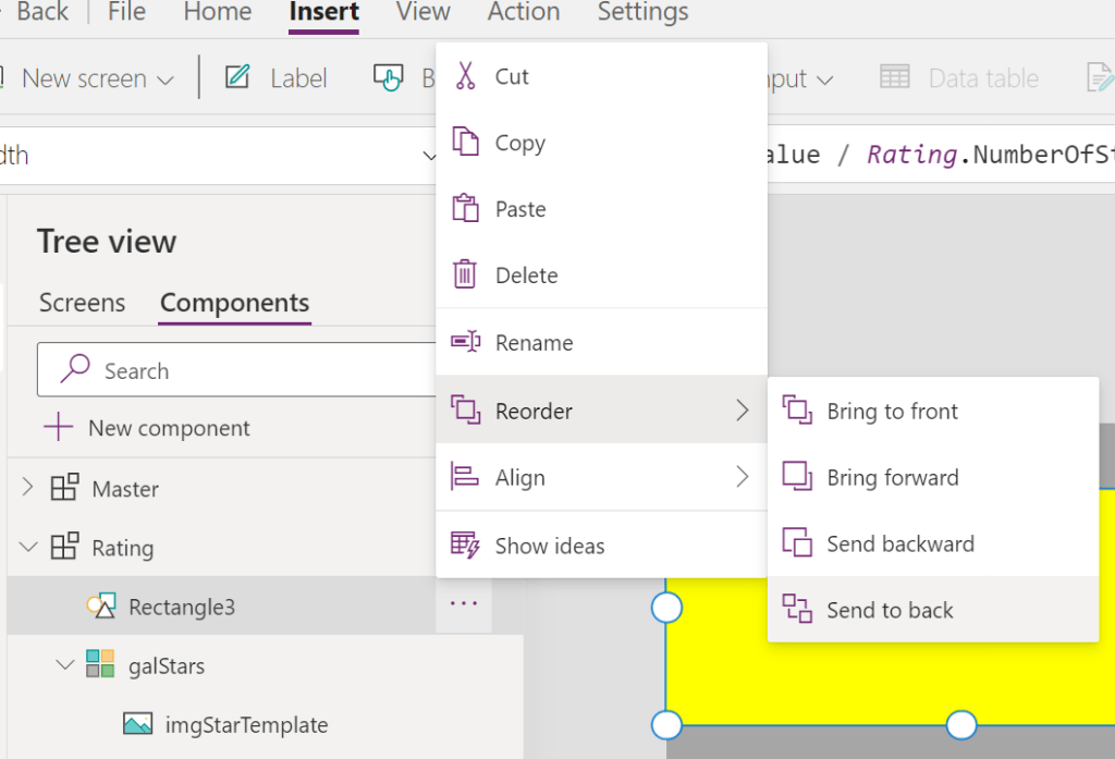
Add a new Rectangle icon to the component
Add a rectangle icon to the component and update the following properties:
Color: Rating.Color
X: 0
Height: galStars.TemplateWidth
Y: Rating.Height / 2 - Self.Height / 2 // Center the rectangle vertically
Width: Rating.Value / Rating.NumberOfStars * Rating.Width
Now you should have something like this:

Finalize
Almost there, next thing to do is to move the rectangle behind the gallery.
And finally, change the fill color of the component back to the color that matches the color of the canvas where the new rating control will be used. You should end up with something like below.
 terhoantila.com
“And finally, change the fill color of the component back to the color that matches the color of the canvas where the new rating control will be used. You should end up with something like below.”
I dont understand this, can u give me example pictures?
LikeLike
Hello Huy, this means you should edit the Fill property of the component so that it matches the background color of your screen 😊
LikeLike